We have to admit, the deck didn’t impress us, but given its successful funding round, it’s worth exploring areas for improvement. Let’s dive in!
Slides in this deck
Rypplzz’ nine-slide deck lacks essential information for a $3 million funding round. It’s missing details on the team, the problem being addressed, business model, pricing, competitive analysis, and contact information for the CEO. As you’ll see below, the deck fails to answer many of the questions an investor would ask. However, it’s important to remember that the deck is just one part of the fundraising process.
The deck is also quite large at 33MB, which exceeds the recommended size of 20MB. Large file sizes can cause issues with email servers, making it important to keep deck sizes manageable.
Slides in the deck include:
- Cover slide
- Product overview
- How it works
- Disrupting the augmented reality industry
- Market applications
- Physical and cyber security
- Current GTM partners/clients
- Investment proposition
- Closing slide
Three areas for improvement
Exploring some use cases
[Slide 6] The text here is as legible as a doctor’s handwriting. Image Credits: Rypplzz
While the use case slide has some readability issues and unclear visual elements, it does demonstrate the potential application of the product, which is important for investors to envision its real-world use.
Product overview

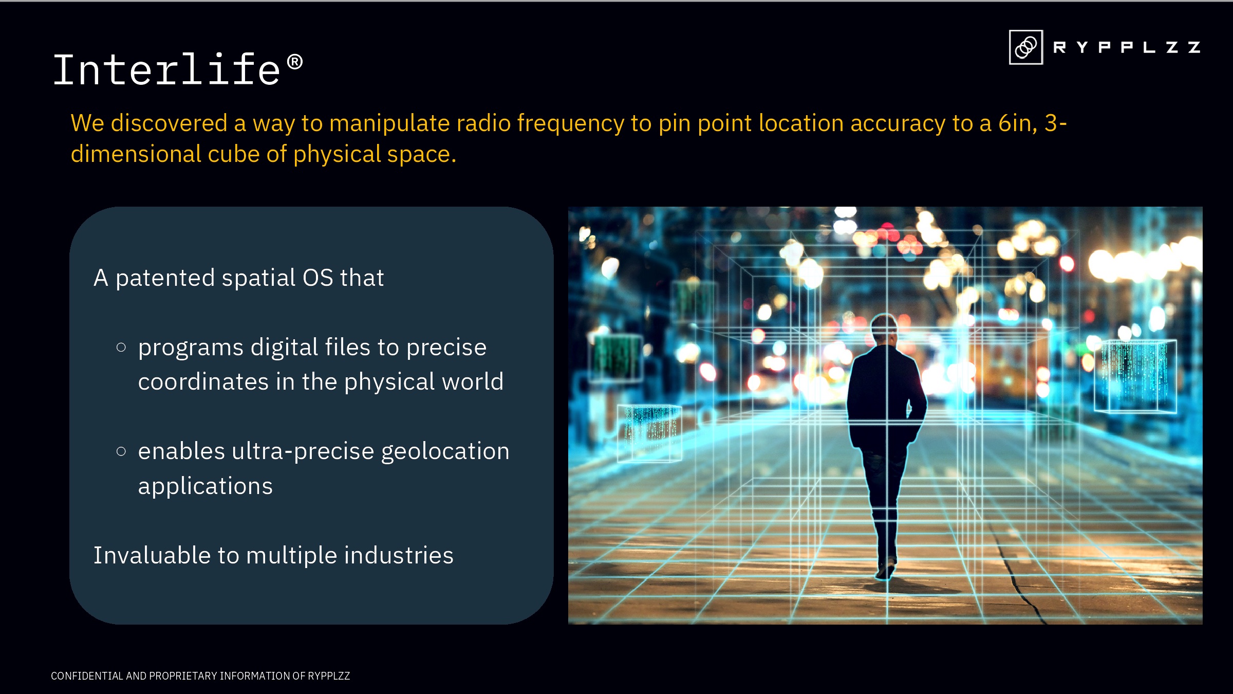
[Slide 2] Taking a closer look at the product. Image Credits: Rypplzz
The product overview provides a high-level view of the product but lacks specific details that investors typically look for, such as unique features, development stage, and differentiation from competitors.
The ask and use of funds

[Slide 8] Straight to the point. Image Credits: Rypplzz
The ask for funding is clear and straightforward, but the use of funds section lacks specific details, making it vague and generic. Providing more clarity on immediate opportunities, deployment contracts, and additional patents would enhance this section.


