yellowpicturestudio/Getty Images
If you frequently use Microsoft Excel for tasks involving data analysis, you know how challenging it can be to interpret the information. Graphs can simplify complex data and enhance the overall readability of your Excel spreadsheet.
Here’s a step-by-step guide on how to create a graph in Microsoft Excel.
Inserting a graph in Excel
Step 1: Input your data into the Excel spreadsheet with each column having a clear title. If needed, you can easily add or rearrange columns.
Feel free to refer to the sample provided in the screenshots for better understanding.
Step 2: Select the cells containing the data you want to visualize in your graph.
Step 3: Navigate to the Insert tab and choose Recommended charts to select a graph template. Customize the template as needed and click OK.

Image used with permission by the copyright holder
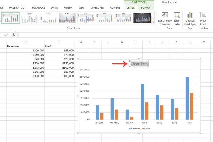
Step 4: Customize your graph by modifying title, size, colors, and data values. Use the icons provided for further customization.
- Plus-sign icon: Add or remove chart elements.
- Paintbrush icon: Change color scheme or style.
- Filter icon: Filter data to be included in the chart.

Image used with permission by the copyright holder
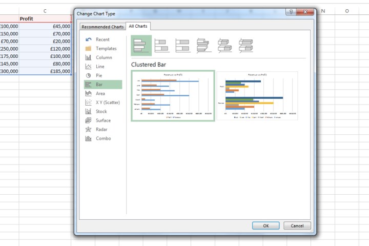
Step 5: Explore various graph types by selecting the All charts tab. Choose from options like Bar or Line charts and their different designs.

Image used with permission by the copyright holder
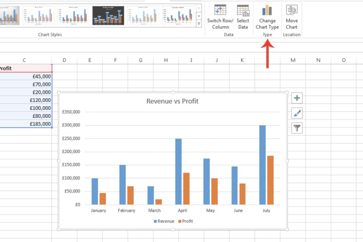
Step 6: Easily switch graph types by selecting the Chart design tab and clicking on Change chart type.

Image used with permission by the copyright holder
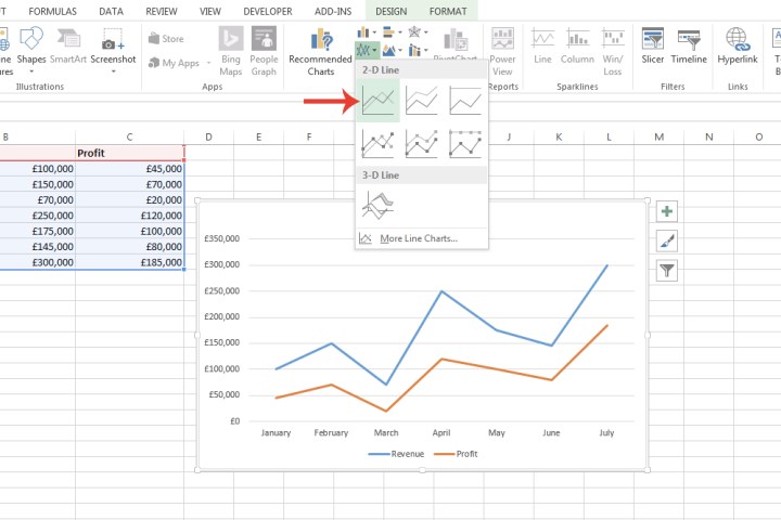
Step 7: Browse through different graph types by selecting the drop-down arrow next to each chart icon. Preview the available designs before making a selection.

Image used with permission by the copyright holder
Creating graphs in Microsoft Excel is straightforward, making data visualization simple and effective. Consider these steps for better data representation in your spreadsheets.


